There’s a pretty heated Twitter debate going on right now about the stark difference between the UI experiences in FromSoft’s latest hit, Elden Ring, and Ubisoft’s tentpole title, Assassin’s Creed Valhalla. The beef boils down to this: Elden Ring feels like a more expansive and immersive game because it doesn’t clutter the player’s vision with a deluge of icons and waypoints leading to the next quest or collectible. In contrast, Assassin’s Creed as a series has become synonymous with a crowded map and busy heads-up-display (HUD).
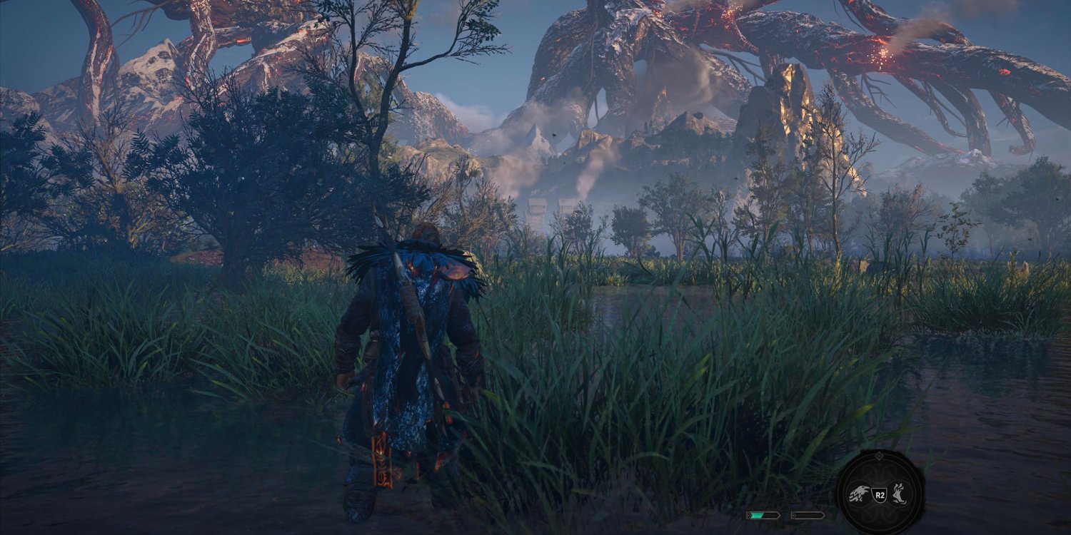
It's a delicate conversation to join, especially with the rabid zeal with which FromSoft fans vouch for their favorite developer. Personal preference will always reign supreme, but I wanted to test this theory for myself to see if a minimalist user interface (UI) could really make Assassin’s Creed Valhalla a more enjoyable experience. I recently dove back into the game to play the newest expansion, Dawn of Ragnarök, and I shut off several of the pervasive HUD options, including the mini-quest log and overhead compass, in an attempt to simulate the kind of UI Elden Ring fans are raving about.
Almost immediately, the game felt incredibly different. I no longer knew exactly what to do or where to go, and feeling legitimately lost in a game that’s known for holding your hand was a strange experience. I realized just how much I’d been relying on the mini-quest log to guide me through the game, and the sudden loss of its constant presence left me feeling stranded.
With the lack of the compass bar at the top of the screen, Eivor’s raven, Synin, became an absolutely vital resource for scouting out nearby points of interest and orienting myself toward the next quest step. I stumbled around Svartalfheim like a blind baby, running into random encounters and fighting my way through several of the expansion’s toughest enemies purely by accident. I’ve heard more than a few players describe a similar phenomenon when talking about their experience with Elden Ring.
Over time, I realized that Ubisoft has incorporated seamless cues to provide crucial information without the need of all these UI aides, including a variety of audio and visual hints that are built right into the game’s environment. These clues helped guide me through the game without the need for HUD elements, and deciphering each one revealed the level of detail and care that went into developing this world.
This was most evident in the story missions where I had to track enemies by their footprints; before, the compass would simply point me in the right direction, while the quest log broke down everything I need to do, step-by-step. Now, I had to actually look for the footprints to stay on the right path, and, once the trail went cold, I relied on Synin to help me pick it up back up again. It fulfilled that goal of immersion video games are always chasing and transformed a game I’ve been playing for years into something entirely new.
I haven’t spent much time with Elden Ring yet, but from what I’ve experienced with Assassin’s Creed Valhalla, I understand what fans of the game are trying to convey. There is something about leaving the world around you a mystery that just feels good, no matter the game. Having guided options is great, especially for accessibility purposes, but the thrill of exploration and unintentional discovery cannot be overstated.
Discovery is a huge part of what makes video games great. It's a quality that made The Legend of Zelda: Breath of the Wild so beloved, and it’s a large piece of why so many people are responding positively to Elden Ring. It does the same to Assassin’s Creed Valhalla, and I only wish I’d discovered it sooner.
