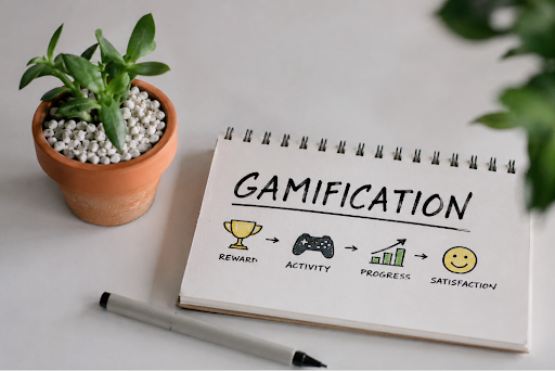
Game design used to belong mostly inside games. Points, levels, streaks, unlocks and progress bars made sense because players had entered a space built around challenge and reward, but the boundary walls around that feel as though they’re fraying. Fitness apps celebrate streaks. Shopping platforms add countdowns. Learning apps hand out badges. Social platforms reward attention with likes, views and tiny bursts of validation. None of these are video games, yet many use the same psychological tools that make games satisfying, sticky and hard to leave alone.
The question is not whether these tools work. They clearly do. The better question is whether they still help the user, or whether they have started serving the platform a little too well to bring in more popularity.
Gaming Psychology Was Built Around Motivation
Good games understand motivation extremely well. They give players progress, feedback, challenge and reward in a way that feels natural. When someone levels up, completes a mission or unlocks something new, the brain gets a simple message: effort led somewhere.
That loop can be genuinely useful. It helps people learn, build confidence and stay engaged long enough to improve. A difficult task feels easier when progress is visible and a long journey feels less overwhelming when broken into smaller wins.
Other industries noticed that too.
If progress bars help players continue, why not use them in education? If streaks encourage return visits, why not use them in fitness? If timed rewards keep games lively, why not borrow that structure for shopping, finance, entertainment or casino platforms? In practice, things get more complicated.
When Engagement Starts Feeling Engineered
There is a big difference between useful feedback and engineered dependency. A learning app that tracks progress can be helpful. A shopping app that creates artificial urgency around every decision feels less generous. A platform that rewards consistency can support a habit, but one that makes missed days feel like failure can turn simple use into pressure.
Anyone who has played games with daily rewards or limited-time events knows that feeling. Those tools are not always bad. They can make an experience feel fresh, but can also make leaving feel like missing out.
Once non-game platforms lean too heavily on that feeling, the user is no longer just being guided. They are being held in place.
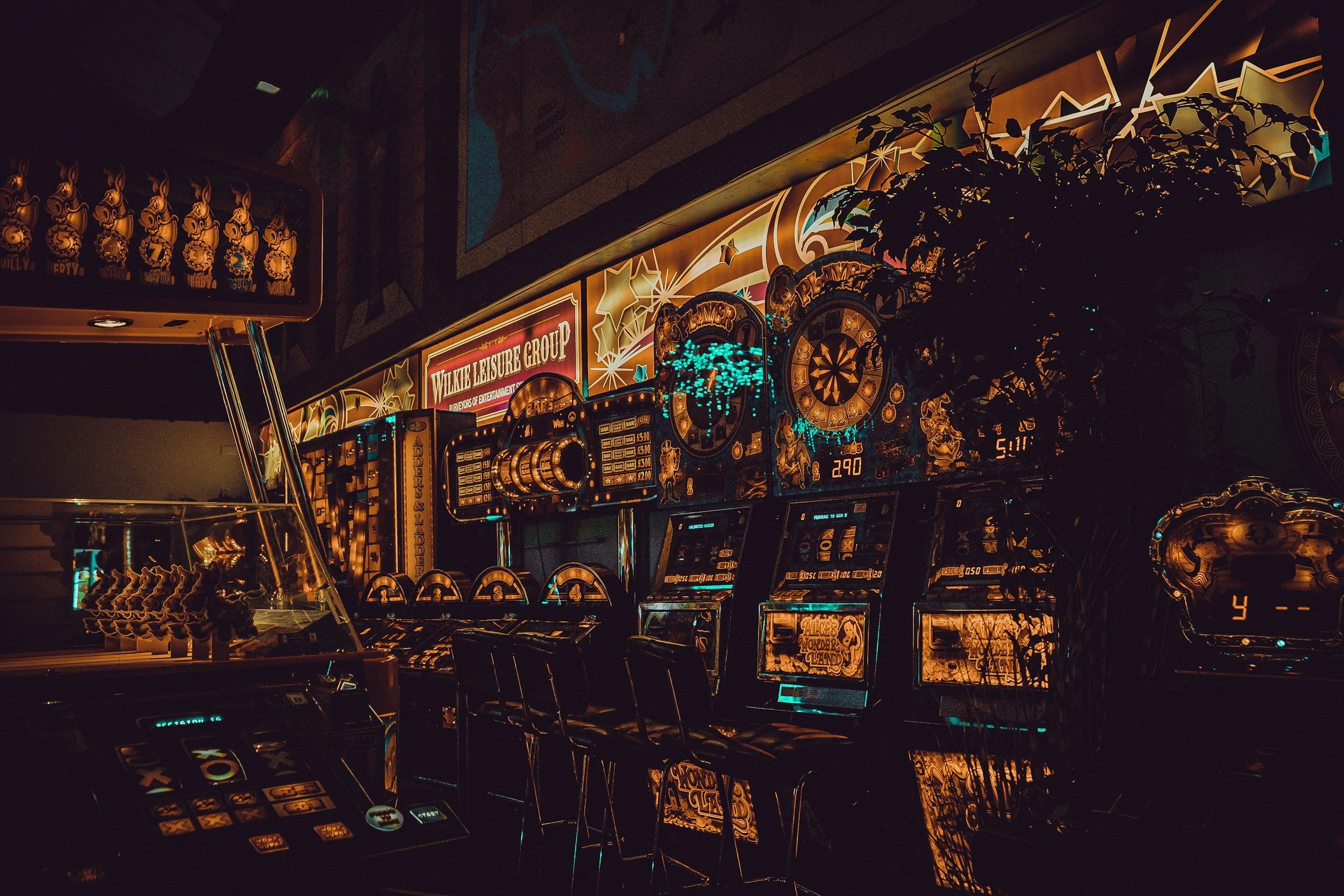
Why Casino Platforms Make the Comparison Clear
Casino platforms sit close to the border between entertainment, decision-making and reward design.
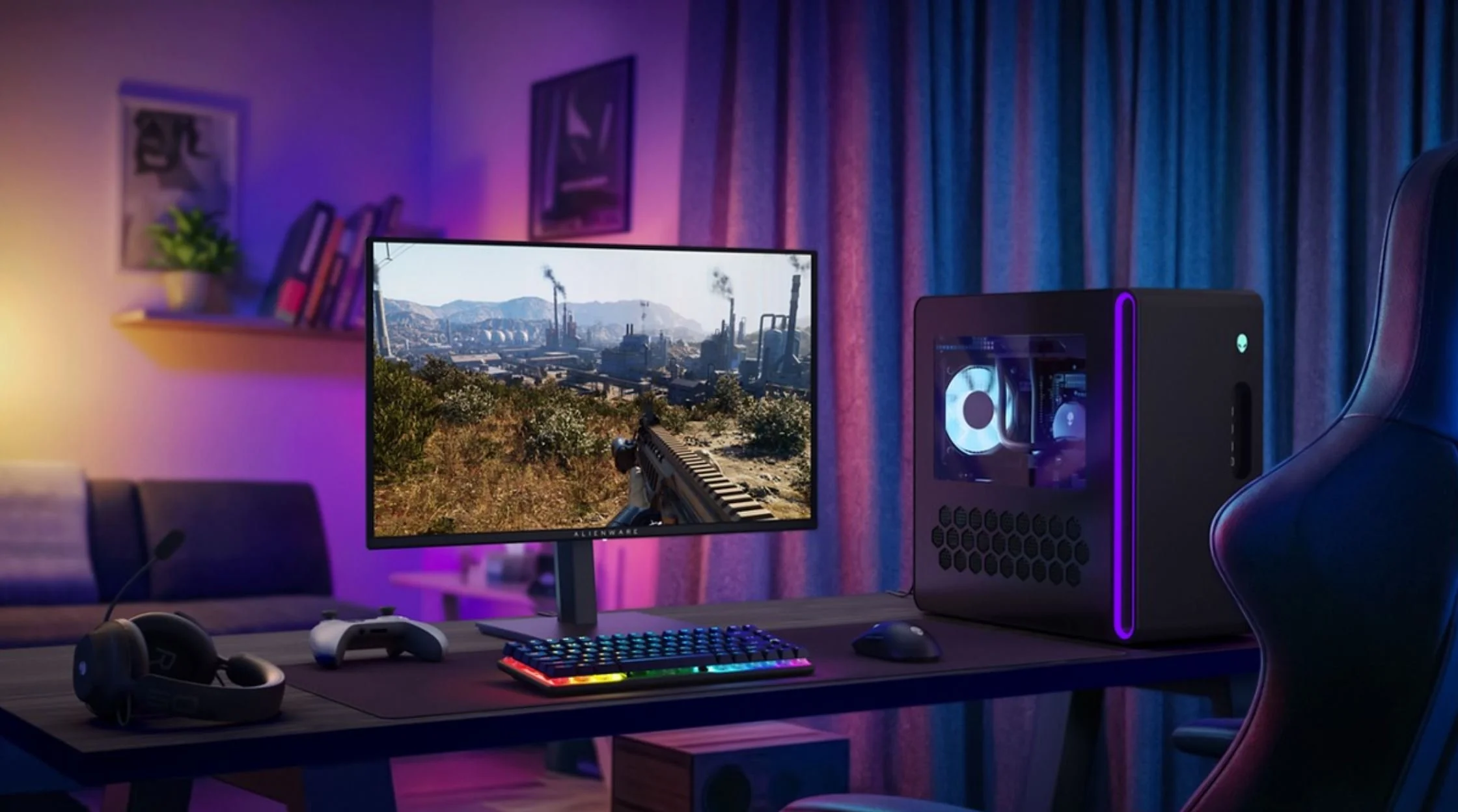
An online casino Ontario platform, for example, needs to be clear, responsive and easy to move through. Users should be able to find games, understand what they are playing and stay aware of the pace of each session without being buried under noise.
That clarity helps because casino games already carry their own tension through chance, timing and outcome. When too many game-like layers are added around that, the experience can become cluttered rather than better. Badges, constant prompts and streak-style mechanics may increase activity, but they do not always improve the session itself.
The stronger design choice is often restraint. Let the games carry the energy. Let the interface support the user. Make the platform easy enough to understand without pushing people from one action to the next.
Lessons From Games Can Still Be Useful
Some ideas are genuinely helpful. Clear feedback helps people understand progress. Good visual hierarchy makes platforms easier to use. Small rewards can make repetitive tasks feel less dull. A strong onboarding flow can take something confusing and make it manageable.
These ideas work when they respect the user’s goal.
A fitness app that shows progress toward a personal target is using game design in a helpful way. A finance app that breaks a savings goal into smaller milestones can make better habits feel easier. A learning platform that rewards completed modules can help users stay motivated without feeling lost.
Intent matters.
When design helps someone do what they came to do, it adds value. When design mainly exists to stretch a session, create urgency or encourage more spending, the same tools start to feel different.
The Line Between Fun and Friction
The best games know when to get out of the player’s way.
That lesson often gets missed outside gaming. A digital platform can use feedback, rewards and animation without crowding every action. The moment each click becomes another prompt, pop-up or nudge, the experience starts to feel heavy.
Non-game platforms often mistake activity for satisfaction.
More notifications do not always mean more value. More rewards do not always mean more enjoyment. More prompts do not always mean better guidance. Sometimes they simply add friction while pretending to create excitement.
Good design leaves room for breathing space. It encourages without cornering. It gives feedback without shouting. It helps users make choices instead of burying those choices under persuasion.
The Human Test
The simplest test is still the best one.
After using a platform, does the person feel helped, entertained or more capable than before? Or do they feel pulled around by a design that kept asking for one more click, one more minute or one more action?
That difference matters the most.
Gaming psychology has given non-game platforms powerful tools, but power needs taste. The goal should not be to make every app feel like a game. The goal should be to make digital experiences clearer, more rewarding and easier to understand without turning every interaction into a trapdoor.
Games work because people choose to play them, not feeling forced to stick around.