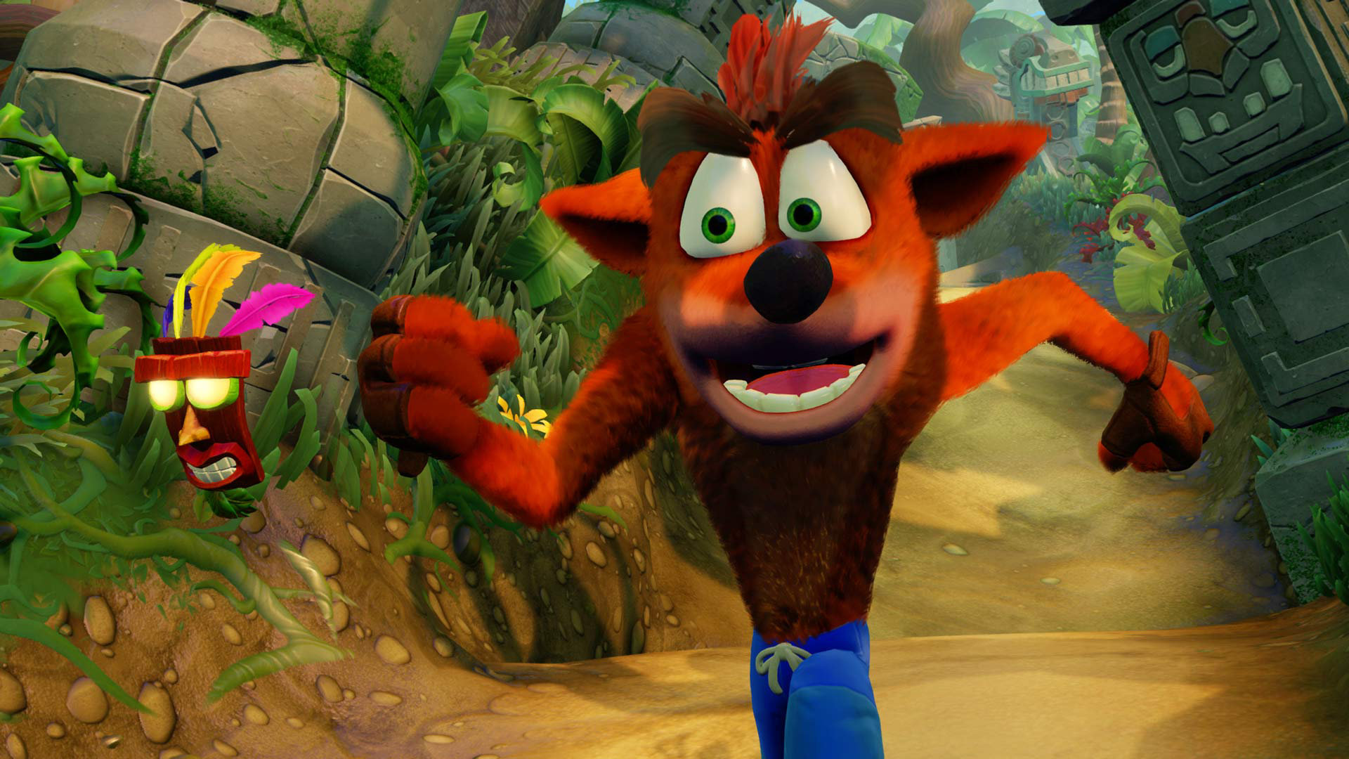
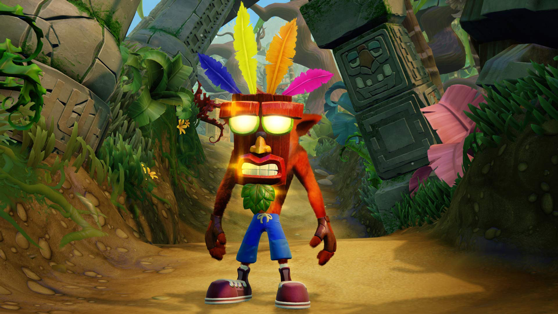
Many are excited about the Crash Bandicoot N. Sane Trilogy remake, but let's take a look at the entire level Hang Eight from Crash Bandicoot 2: Cortex Strikes Back. The video featured is by YouTuber Ingram Mill.
Trying to push my nostalgia to the side and not berate every little detail of the comparison with full blown opinions, I would have to say that the overall improvement makes the scenery seem more subtle than it used to. The panels are even darkened for the new version verse the bright tan used in the original classics. I prefer the color textures they went with in the remake over the classic textures.
I love how they got all the small details in the correct place however. Such as all the boxes are EXACTLY where they are meant to be, not just "close enough," as sometimes happens in a remake. The boxes, enemies, obstacles, extra zones, and gems all seem to be in the exact location they are meant to.
Now it may have been the player, but it seems they have become less generous with the apple count, as the classic side was racking up apples at nearly twice the rate! But, without further commenting, check out the video for yourself:
