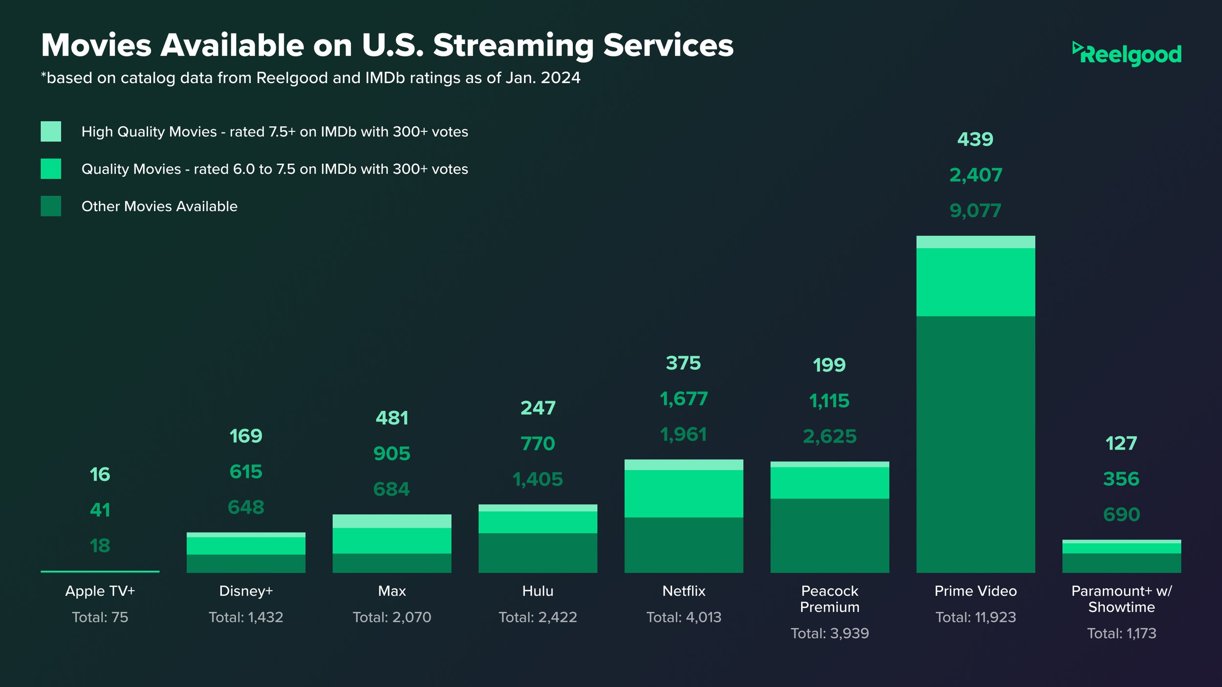
The world of streaming services is a shifting and evolving flurry of content, pricing models, and subscription models. The only thing I’ve found to be 100% constant is change. With all that change, it can be hard to keep up on what are the best values depending on the kind of content you are seeking. Even services like Amazon Luna make streaming games across all your devices possible. It’s an exciting yet strange new world trying to decide which subs to get around and which we should dump.
Whether it’s TV shows, movies, or a mix of the two, it can be hard to differentiate between the sheer amount of content available and the quality found within. The folks at Reelgood have put some data together and the results are extremely interesting. Hopefully, the graphs provided here will help you decide where to put your hard-earned greenbacks!


