Story and Gameplay:
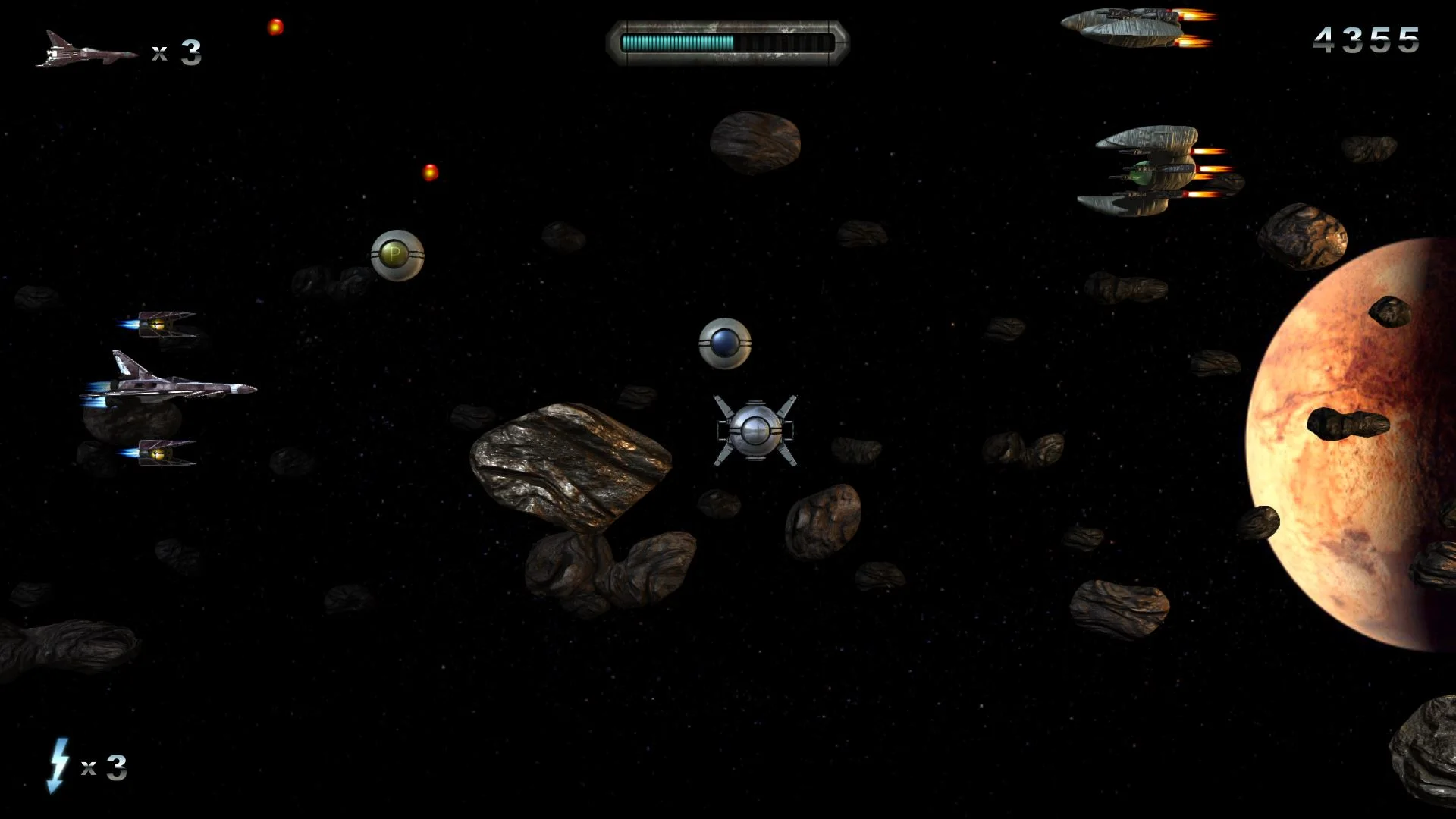
There is no story in Crush, it is all about the gameplay. It is a space shoot ‘em up game similar in play style to Gradius. You are a spaceship continuously scrolling to the right as bad guys and asteroids come at you. You can move around to dodge or shoot them to pieces and get power-ups along the way. You may find it hard to shoot the bad guys though since the controls are not very intuitive except for the movement controls. There’s no tutorial or screen to tell you the controls so you end up just pushing random buttons until you figure it out (‘A’ is to fire and ‘Space’ is your super weapon). There’s also no indication as to when you get hit except a small health meter up top.
Graphics and Sound:
Visually, this game does rather well. Everything looks nice. Not great, but I wasn’t thinking it looked bad. They also, went for a design so the background was more 3D and not just a flat background, and on some occasions, objects on the screen are over your ship for more effect. While this effect looks nice, it isn’t without problems. I found myself crashing into objects because I thought they were farther in the background.
The music and sound for this game are good. They are very fitting with the theme and environment and are quite possibly the best part about this game.
Replay Value:
Once you get through the 7 levels I don’t see too much replay value unless they come out with some DLC like additional levels or game modes.
What Could Be Better:
When you start a new game or in the Options panel, include a screen that explains the few controls. This helps new players not die after two seconds as they try to quickly go through their entire keyboard. Another great improvement would be to have your ship flash or at the very least have a sound for when you take damage. There are plenty of times where the screen is full of danger and if you glance at your health bar, you’re dead. A simple thing like that could also help the player realize that object is on the same plane as you and not in the background. Finally, make it a bit more obvious if something is in the background or foreground.
Verdict:
Color me frustrated. I had so many rounds come to an end because an object I thought was in the background was really in the foreground and was one that would cause instant death. Combine that with frantically trying to figure out the controls and not having any indication that I’m being hit until I find the health bar up top, and it is not a good experience. I think with some tweaking via updates it could be polished for a much better experience, but for now, it’s only for die-hard fans of the genre.
