A picture is worth a thousand words, but sometimes just one can change your perspective. When looking at a card, the art tells a story; sometimes it’s funny, sometimes sad, sometimes it’s just descriptive. When you combine it with the flavor text, however, that story may change.
Lava Axe was first printed in Portal with the flavor text “Swing your axe as a broom, to sweep away the foe.” The art depicts an axe in motion, and together they paint a serious picture of someone using the spell as a very useful but very deadly weapon.
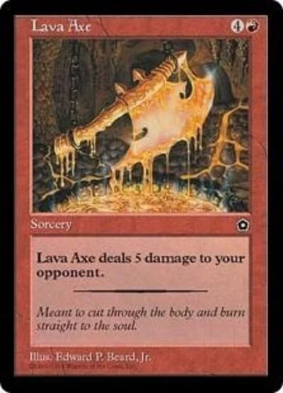
Portal Second Age updated the flavor text to “Meant to cut through the body and burn straight to the soul.” The art changed as well to a molten axe being forged from a bubbling pool of lava. It invokes a sense of dread that this spell not only can destroy one’s physical form but also one’s essence; not something I’d like to see headed towards me.
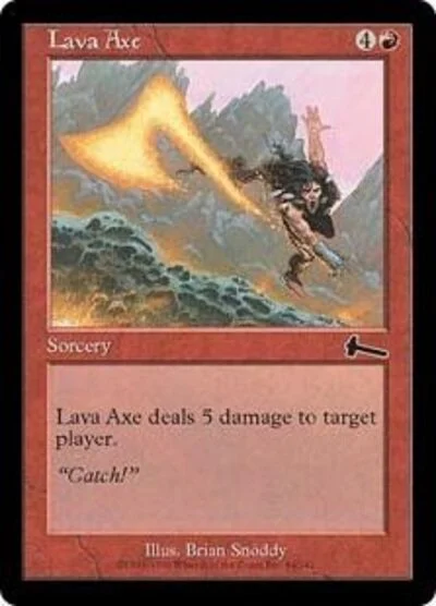
Urza’s Legacy saw the art change to an action shot with the axe headed past the viewer and the flavor text “Catch!” The change in text is incredibly important. This reprint shows a side that is not often attributed to red: humor. As the color of rage, red is almost always shown in an angry, destructive light. The art certainly shows this, but the flavor text changes the context to someone who is not just enjoying the fight, but one who finds humor in the midst of battle.
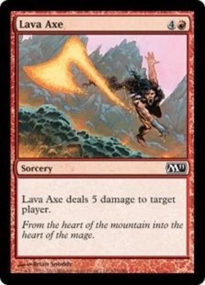
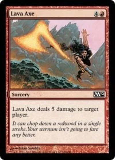
Every printing beyond Urza’s Legacy (minus 7th Edition) kept the same art. The Starter 1999 and 7th Edition versions had the Portal Second Age and Urza’s Legacy flavor text, respectively, though the flavor text changed a few times beyond those printings. The M11 text returns to the hack and slash of red’s main themes with “From the heart of the mountain into the heart of the mage.” It’s a bit disappointing to see red return to its combat roots instead of branching out again, but the juxtaposition of the different hearts does help flavor red a bit more.
The very next printing gave us “It can chop down a redwood in a single stroke. Your sternum isn’t going to fare any better.” Next to green, red is the color of sheer power. The flavor text allows us to see this as well as giving a bit more humor to the spell that cuts your life by a quarter. It’s no “Catch!”, but it’s still well done.
“A strict upgrade over the cinder hatchet.” Again, the text shows us red’s obsession with power with a dash of humor thrown in. I like this text a lot and would love to see Cinder Hatchet as a 5-cost spell that does 4 damage to a player.
Small things like flavor text allow you to add depth to a world where the viewer can immerse themselves. Descriptive, humorous, short, long, it doesn’t matter; as long as it makes sense, it helps. World building is about telling a story and when you want to make it good, give yourself access to every little space you can. The viewer will thank you for it.
