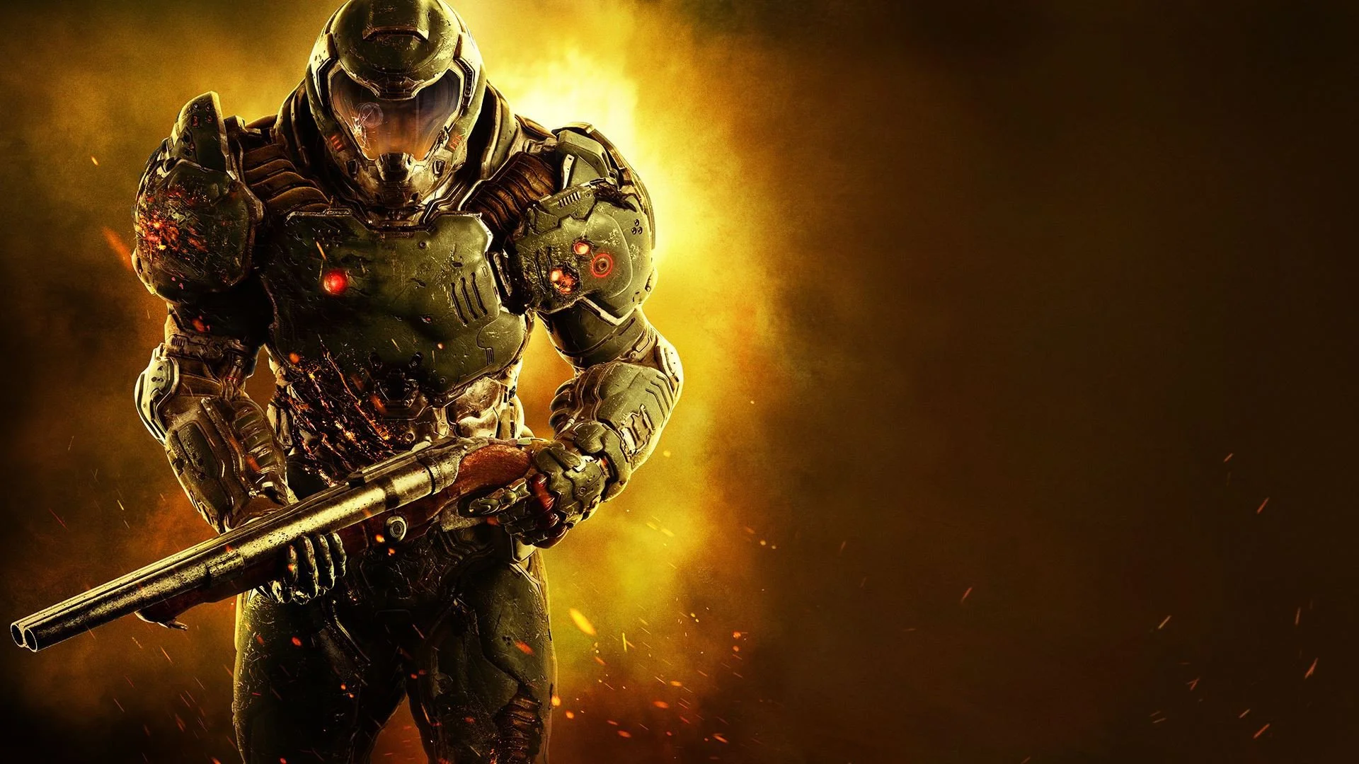
Option B.
Vote Like Hell, you say? You bet your ass I will.
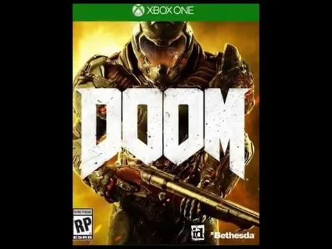
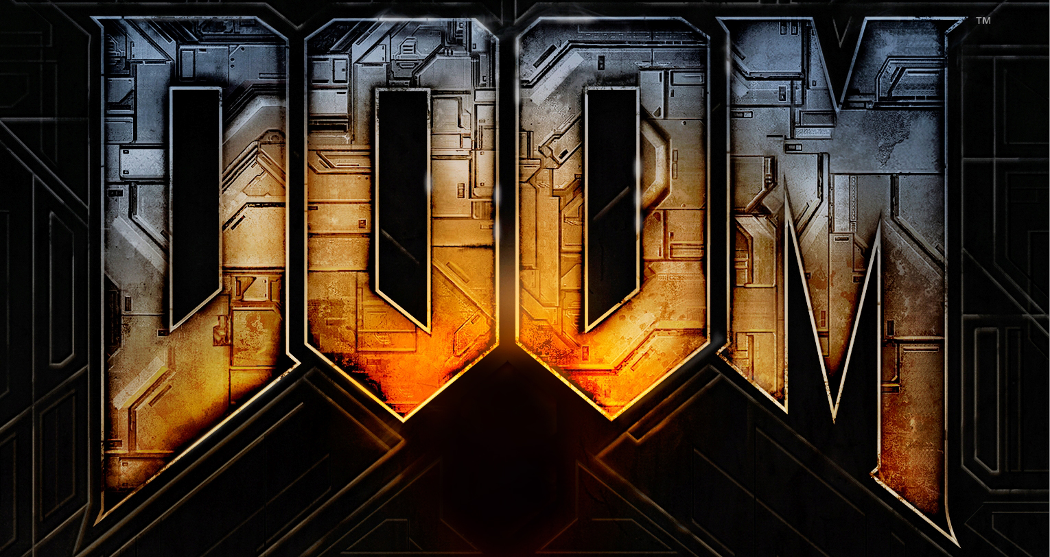
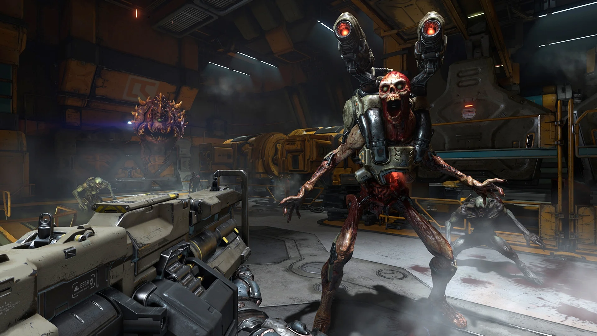
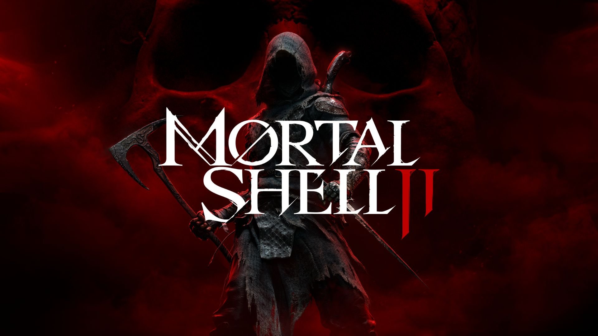
Look, I was never about to flip a table over the originally pitched DOOM box art, but it struck me as trying too hard to bring everyone in. DOOM is what it is, you’re either going to like it or not, and the box art shouldn’t be trying to pretend this is a generic everyday space shooter. Now if you’re a marketing pro in games and you have some way to quantify how the more generic package works better, then I shall rest my case. I would rather have more copies sold than lose it over the box art, but if there’s an actual way to gauge how one performs better, then whatever—I’d rather have the devs being handsomely rewarded so more games get to be made and more devs get to feed themselves and their families.
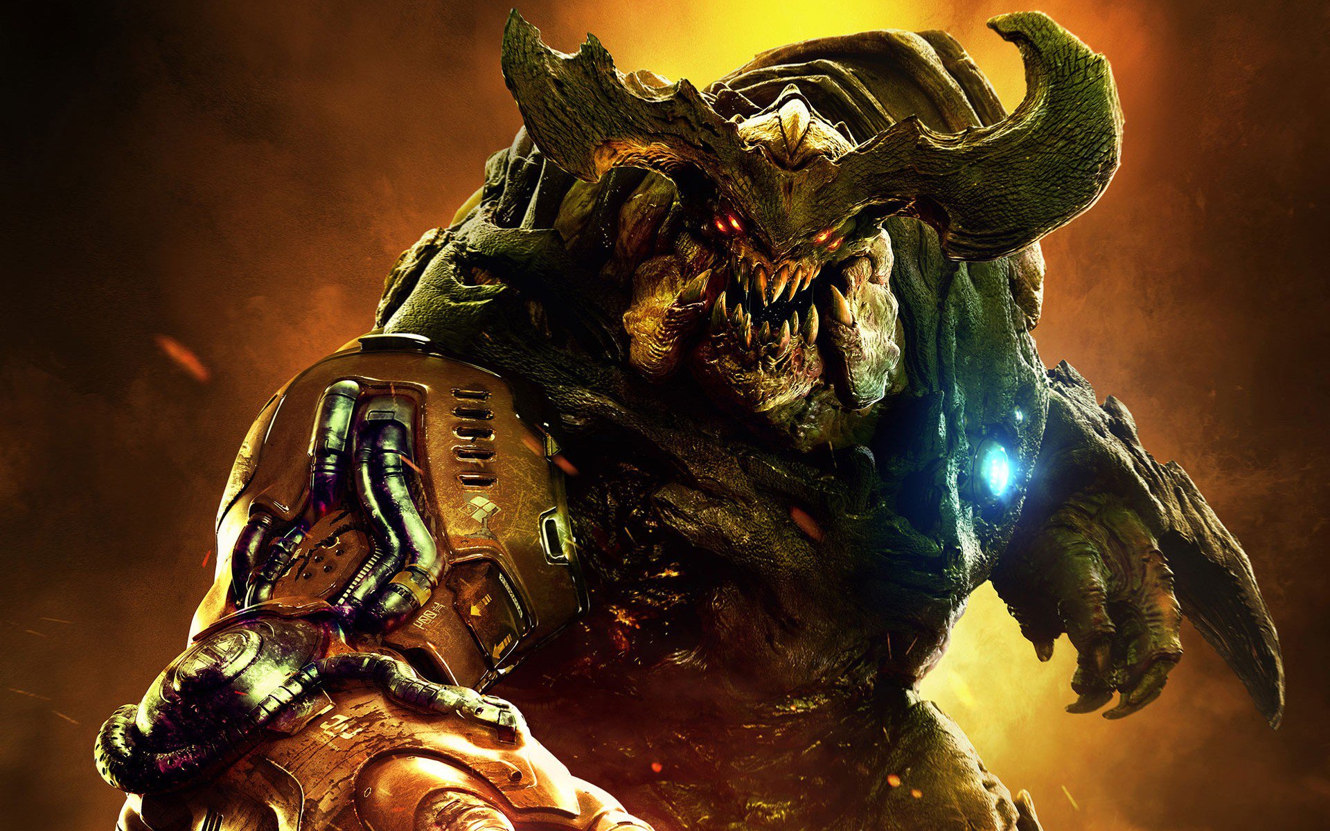
Option A.
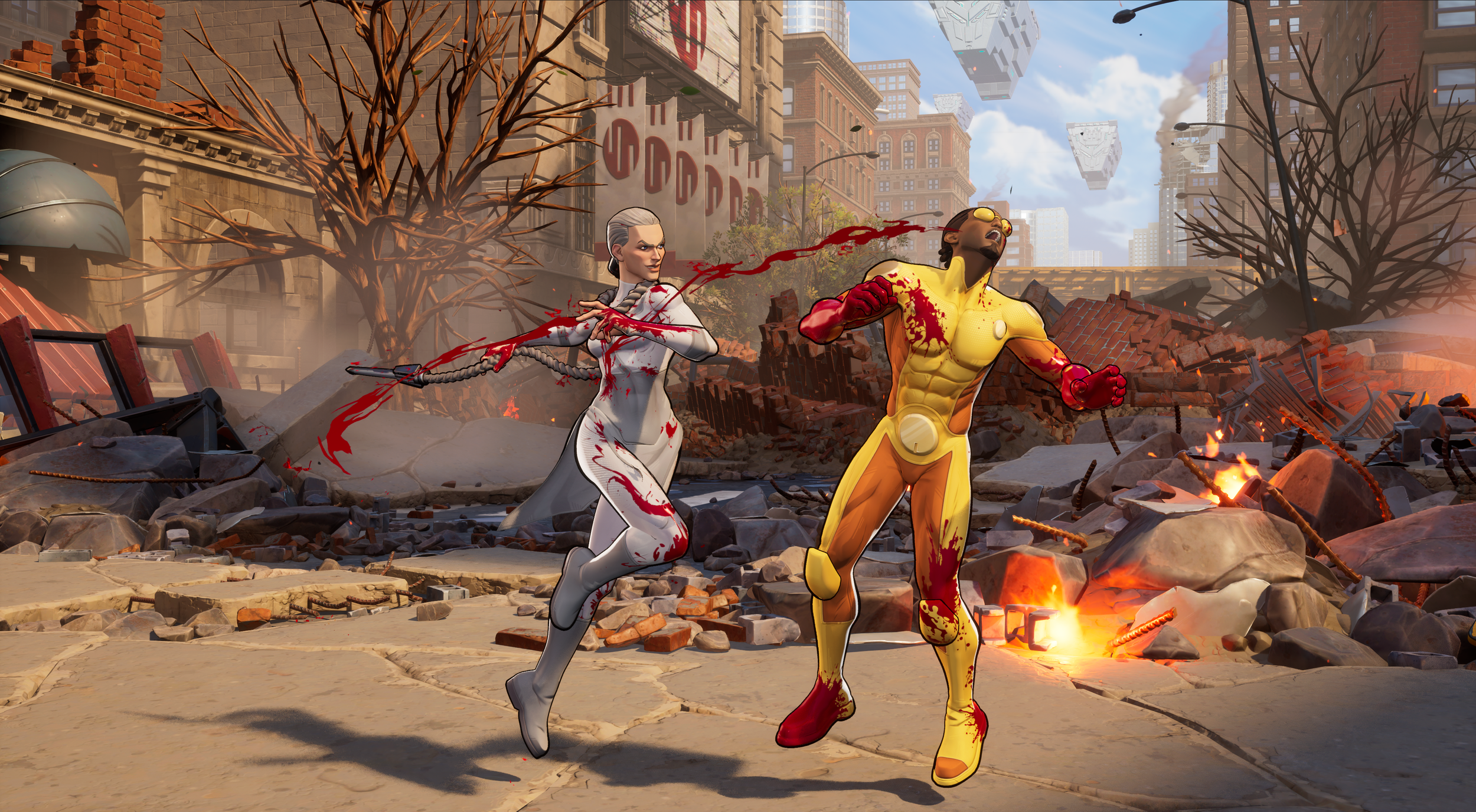
So far it’s looking like Bethesda’s poll on DOOM’s twitter account is showing that option B is the clear winner according to voting results. Option A is there too for those of you who aren’t messing around and want to get straight to dealing with the devil. I guess I’m an option A kind of guy because it highlights the fun of kicking an avalanche of hellspawn right back to where they belong. Which isn't far away, because you know, you're already there.
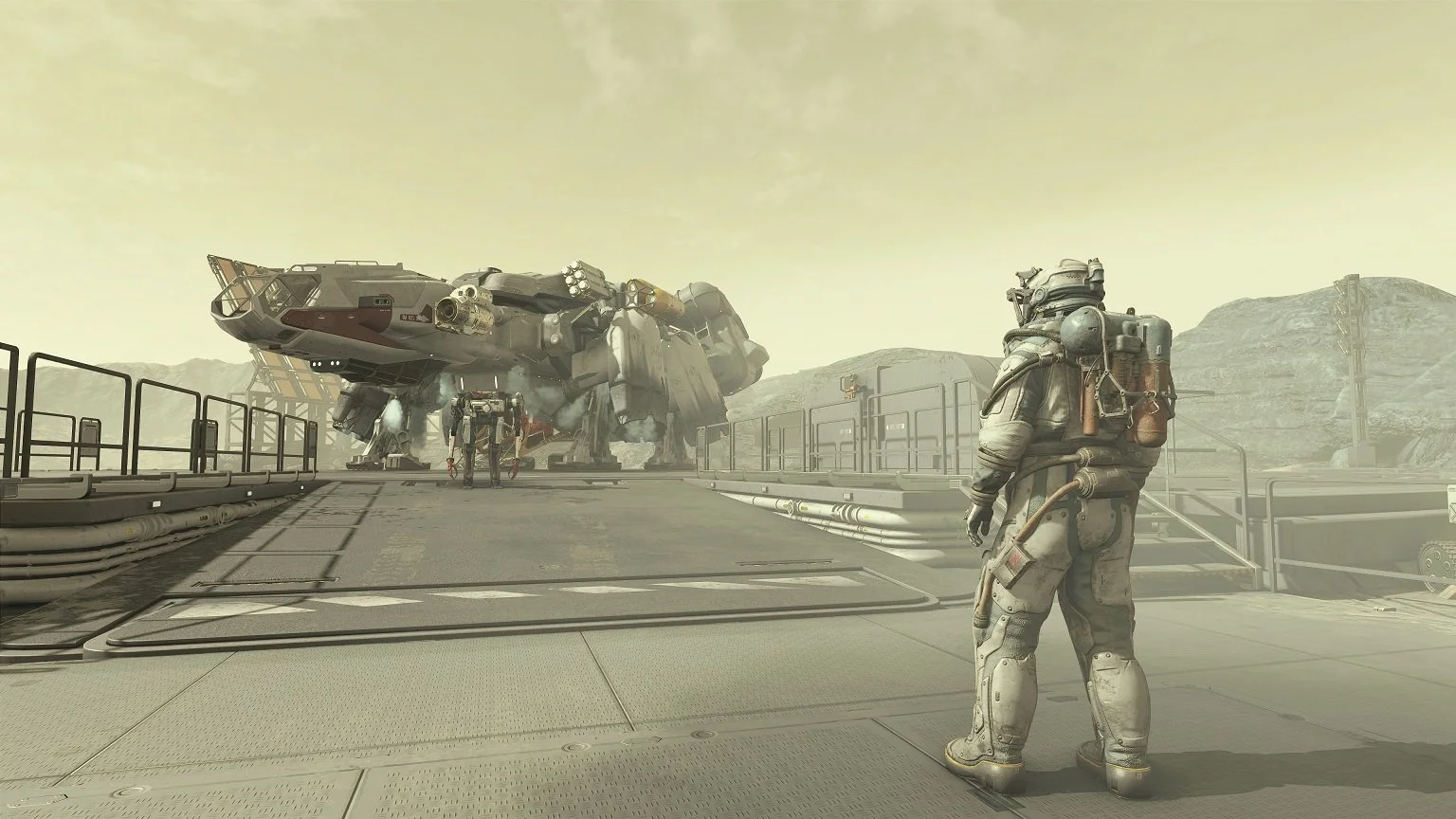
As for what option the original cover is? I’m calling it Option M for Option Marketable because that's the only reason I can speculate for this design. Personal preference in order: BAM.
Option M?


