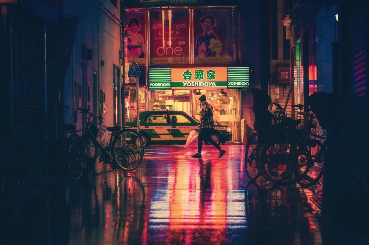
You have probably felt a sudden surge of déjà vu if you’ve spent any time scrolling lately. Neon pinks and those unapologetically bold gradients are popping up everywhere. It’s not just a glitch in the matrix because the 1990s are back, and they have staged a full-scale coup of modern User Interface (UI) design.
For a long time, the internet was obsessed with looking adult. People moved into the era of flat design. Think of Apple’s sleek minimalism or Google’s clean white spaces. It was professional and efficient. But sometimes it’s a little bit boring. Now, the pendulum is swinging back. People are ditching the sterile corporate look for something that feels a bit more human.
The Death of the Minimalist Fatigue
For the last decade, every app has started to look the same. Whether you were checking your bank balance or ordering a pizza, the UI was predictably clean and safe. Designers call this Minimalist Fatigue.
The 90s revival, often called Neo-Retro or Y2K Aesthetic, is the perfect antidote. It’s loud and it doesn't take itself too seriously. By bringing back elements like high-contrast borders, developers are breaking the monotony. It’s a way of saying, "Hey, there’s a real personality behind this code."
Nostalgia is a Hell of a Drug
There’s a reason this hits so hard for Millennials and Gen Z. For Millennials, these visuals trigger memories of the Wild West of the early internet. For Gen Z, it represents a "lo-fi" authenticity that feels more honest than the polished and AI-generated perfection of the 2020s.
Brands are smart because they know that if they can make you feel something, you’re more likely to stay. Using a retro color palette isn't just a stylistic choice. It’s an emotional handshake. It grounds a high-tech product in a familiar, comforting past.
The Old School Reliability Factor
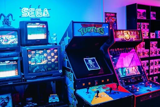
Interestingly, this trend isn't just for fashion brands or indie games. Even industry veterans are leaning into their heritage to prove they have stood the test of time. In a digital world where fly-by-night apps disappear in a week, longevity is the ultimate flex.
Take the gaming world, for example. It is not just indie developers on Steam tapping into this nostalgia. Legacy brands have mastered the balance of old-school soul and new-school tech. A prime example is Lucky Nugget, which has stayed relevant by pairing its classic, gold-rush-era branding with the modern security and speed that today's tech-savvy players demand. It proves that you don't have to sacrifice your retro identity to provide a cutting-edge user experience.
Why It Works When Done Right
The trick to a successful retro revival isn't just copying and pasting a website from 1998. That would be a usability nightmare. Instead, modern designers are using Selective Nostalgia. They take the vibes of the 90s. The fun and the vibrant colors, which they overlay onto a framework that actually works on a smartphone.
It’s about Tactile Digitalism. People want buttons that look like you can actually press them. They want cursors that leave trails. They want a digital experience that feels like a physical object. In a world that’s becoming increasingly virtual and meta, these 90s design cues give you something to grab onto.
Conclusion
Is this just a fad? Maybe. But the shift toward more expressive and soulful design feels like a permanent move away from the cookie-cutter internet. People are rediscovering that technology doesn't have to be cold to be powerful.
The 90s revival reminds you that the internet was originally meant to be a playground. People are making the digital future a lot more interesting to look at by embracing the pixels and the bold colors of the past.