Review copy provided by Free League Publishing
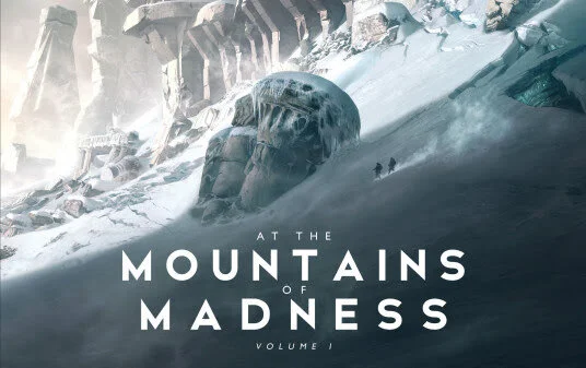
The arrival of At the Mountains of Madness from François Baranger actually started with another H.P. Lovecraft story—The Call of Cthulhu. That American horror classic was first published in 1928 and is considered one of the greatest in the genre. And Baranger, a French illustrator who’s worked in other mediums before now, was intrigued by Lovecraft’s captivating stories and the creatures that lurked in the author’s mind. In his recent work on The Call of Cthulhu, Baranger started illustrating these beloved horror passages and bringing the work to life.
The results were spectacular and he moved on to tackle another Lovecraftian tale—At the Mountains of Madness.
I’ve played a lot of board games inspired by Lovecraft. Elder Signs, Mansions of Madness, Arkham Horror: The Card Game. And others. But I’ve never read the author’s work. I’ve faced off against Cthulhu and been savaged by many of the monstrosities that reside in his horror universe. The source texts have eluded me, though.
Until now. Starting with At the Mountains of Madness, I’ve descended into the dark places where men and women are revealed to be fragile creatures. Thankfully, I have Baranger to guide me with his steady hand and remarkable talent. If you’re like me and you haven’t read H.P. Lovecraft before, then there might not be a better place to start. The first volume of the story is an engrossing read, one that kept me hooked into its pages as if I was wrapped in the tentacles of an Elder One.
I encourage you to voyage south into the white mirage with me.
STORY
I don’t want to spoil too much about the story. As of this writing, I don’t even know how it ends. That’s because this is the first volume of two. I’m undecided about whether I should finish reading the story before the second illustrated volume releases. It’s eating me up inside a little bit. I want to know the ending, but I’m also interested in only experiencing the narrative through the illustrations of Baranger.
What I can tell you is that the story unfolds nicely across the page. Lovecraft reads just as buttery smooth today as he did in the early 20th century. The sci-fi horror novella may have been rejected in the early 1930s, but its place in horror literature is well-deserved.
If like me you had not heard of this novella until now, the story covers the events of an Antarctic expedition in 1930. What’s recounted to the public is a journey of remarkable discovery followed by tragic loss. A scientific voyage that loses members of the expedition under unfortunate but entirely explainable circumstances. What’s not revealed is the truth of the expedition’s downward spiral. The descent into madness and the discoveries that precipitated the undoing. At the Mountains of Madness is told from the perspective of Dr. William Dyer, a geologist from Miskatonic University, who regales the reader with both the innocent details of the expedition, in keeping with the public account, and the more sinister events that were kept hidden until now. Dyer hopes to deter another expedition from making the same mistake as his and this is the cause for his revelations.
The slow pace of the story builds tension and I really enjoyed the frequent questions I had as a reader, wondering when the real story would be revealed and how the expedition would lose control of the situation.
And as a first-time reader of the novella, each page turn was thrilling. I was waiting for the dark and the terrifying to appear with every advance in the story.
H.P. Lovecraft is a master of tension and foreshadowing. I know now that I would have been happy to read this novella on my own at some other time. But I’m immensely happy that this was my first foray into the myths of Elder Gods, eldritch horror, and the dark corners of the world because this volume is a sumptuous marriage of the brilliance of Lovecraft and the evocative talent of Baranger. I’ll be ready in an instant to order the next volume.
VISUALS
Horror stories benefit greatly from art. The visual component lends another dimension to the story which pulls the reader deeper into the experience. It’s why horror movies are so successful. The audio-visual aspects of those narratives—jump scares, tense music, gruesome scenes—heighten the drama, the suspense, and the terror.
So it makes sense why Baranger wants to build the world of Lovecraft’s vivid imagination. It augments the story in such a way that readers have a newfound appreciation for the writing. What also works is the setting. Antarctica is still a relatively obscure place for most readers. It’s mysterious. It’s alien. It’s far removed from the everyday. So it can still inspire awe… and fear.
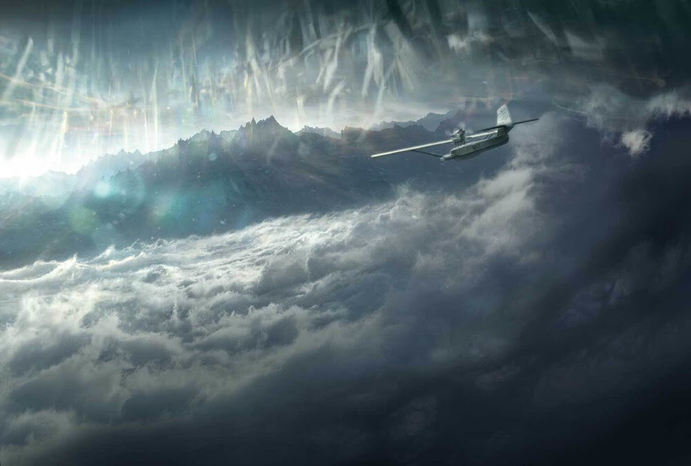
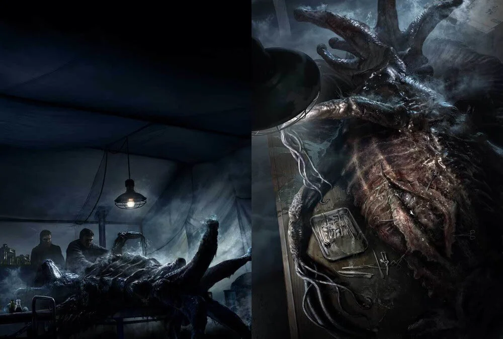
Let’s not diminish or forget Baranger’s success, though. The illustrated volume is beautiful. Blinding whites, warm browns, murky greys, abyssal blacks. All of these colors swirl together and create visceral images of the mountains and the ill-fated expedition of these men from Miskatonic University. The world of Arkham and Cthulhu is one that’s etched into the reader’s memory with these massive landscapes on the page. It burns into our subconscious.
The dramatic scenes which so vividly depict the arctic expedition of the 1930s soak up all of the light in the room and rope in the reader’s eyes until you can’t see anything else. Twice, I dreamed of eldritch horror after poring over these thick pages and dreams are not something I remember often so I commend Baranger in being able to craft a convincing and memorable world.
Even if you’ve read At the Mountains of Madness a hundred times before, you should read this version because the French illustrator has done something really special here.
WHAT IT COULD HAVE DONE BETTER
My biggest complaint was the size of the book. It’s 10 1/2 x 14 inches. It’s truly massive. For those that own a lot of coffee table books, then maybe you won’t mind. But I don’t have a coffee table anymore because I have two kids. And even when I owned a coffee table, I didn’t have coffee table books on it. And my bookshelves won’t fit a book this size on them. Any of my bookshelves. At the Mountains of Madness is quite singular in its size compared to anything else I have in the house.
I’m conflicted because of the size of the book. The images are gorgeous and the bigger they are the more you can appreciate all of the detail that Baranger has worked into each scene. I just don’t know where I’ll put the book now that I’ve read it. It will have to be on display somewhere or stored in a random spot because it won’t fit where the rest of my books are.
So if huge books bother you, you might want to think twice about this behemoth. I guess you can always order it, read it, and then pass it on to a friend, though.
VERDICT
François Baranger has accomplished his dream twofold. In creating such a visual feast for readers, the French illustrator has brought nuance and fresh perspective to the Lovecraft story for fans and avid readers of the horror icon, but he has also introduced a new audience to the tale by combining stunning artwork with the original text. The old bones and atrophied muscles of this haunting narrative have been revivified with the pulsing blood of illustrations rich in color and weighty with subtext. It’s like a blindfold has been removed and given us all another sense with which to explore this story.
As someone who had not read At the Mountains of Madness prior to this illustrated volume, I’m antsy about finishing the story, excited to discover what comes next, and more than ready to see what Baranger has in store for us in the second volume.
If you want to buy Volume 1, it’s out now on the Free League Publishing website.
