Opening a new casino and glancing at the homepage tells me almost nothing about it. That part takes a few seconds. I only start forming an opinion after moving between games, opening the account page and seeing whether the site stays clear after the first few clicks. This Cold bet review focuses on that practical side.
At first, Coldbet feels fairly direct. The important areas are visible without digging through layers of animation. That already helps. Finding the lobby and account page should take seconds, not a tour of the whole website.
The main question is simple. Can a regular visitor understand where to go?
With Coldbet, the answer feels mostly positive. It seems arranged for people who want to get in, find what they need and carry on.
First Look at Coldbet
I spent some time on the site and it made an immediate impression on me. A short look around is normally enough to see if the page makes sense.
The Coldbet homepage felt clear from the beginning. The game area is visible. The account section feels reachable. There was nothing important hidden in any place.
The first things that stand out are simple:
Clear menu
Easy access to the lobby
Page that does not feel too crowded
Visible account area
Predictable navigation
These are basic things. They sound ordinary until one of them is missing. Thousands of titles are not much use when reaching the right one already feels tiring.
Game Lobby and Choice
The lobby is a favorite among online casinos. It's where most players tend to play.
A good lobby should not just show games. It should help people choose. Some players know what they want. Others simply scroll until something looks worth opening.
| Part of the Lobby | Why It Matters |
|---|---|
| Game categories | Help users move faster |
| Search bar | Useful when scrolling through everything feels pointless |
| Simple page design | Makes individual games easier to notice |
| Mobile access | Helps users play from different devices |
I could check one category, go back and open another without wondering where the previous page had gone. That sounds modest, but it is valuable.
Constant noise does not make a casino more useful. Most screens already spend enough time begging for attention.
Mobile Access and Download Option
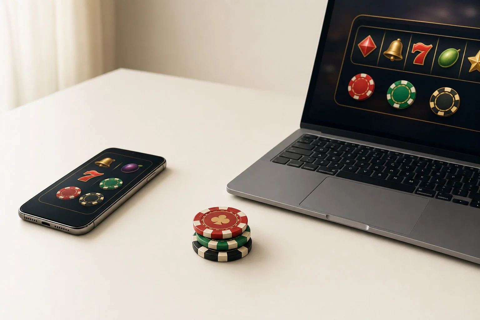
For many players, the phone is no longer a backup device. Many users do not stay on one device. A visit might start on a laptop and continue later on a phone.
This is why the Coldbet download option matters. It can save a little time for anyone who returns often and does not want to begin from a browser each time.
On mobile, I mainly want clear text, dependable loading and buttons that are easy to reach.
Phones expose bad design quickly. A page that looks fine on a large screen can become painful on mobile. Tiny buttons and crowded menus are not charming. They are just annoying.
Account Area and Login Experience
The account page is hardly the reason anyone opens a casino, but it still needs to work properly. It matters every time a user returns.
Logging in, checking details and changing a setting are things regular users do often. These actions should be simple. Nobody wants a casino account area that feels like an office form with brighter colours.
What matters here is simple wording, a login button that is easy to find and a quick route back to the games.
Even a good-looking site becomes irritating when basic account settings are hard to reach.
Final Opinion
Coldbet’s main strength is not one single feature. It is the combination of access, structure and simple movement.
Coldbet works best when nothing interrupts the usual flow. Open the lobby, check a few games, visit the account page and move on.
A casino review should also mention responsible play. Online casinos are entertainment platforms, not financial plans. It is worth deciding on a spending limit and a stopping time before starting.
My view of Coldbet came from the ordinary parts rather than one standout feature. The lobby, account tools, mobile view and basic navigation matter more here than any dramatic first impression. A good online casino should not make the user fight the interface. It should make the path clear.